Exploring the creative process behind building engaging web experiences and the impact of AI on maintaining design consistency across development cycles.
Read ArticleWelcome to my UX Design Portfolio. Explore my design process through these selected projects, each showcasing the evolution from initial concept to final implementation.
A user-friendly application designed to help people easily find who represents them in government, as well as find their voting location.
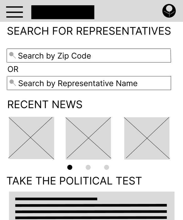
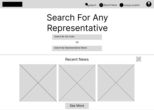
Early black and white designs that focus on the core functionality of the app. This wireframe features two search bars, one for searching by zip code and one for searching by representative name. It also has a "recent news" section with a slideshow menu. Lastly, a political test is located at the bottom so users can figure out where they stand politically.
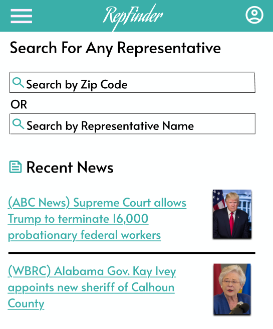
Added color and changed the font. The "take the test" section was removed after interviewing users. Something to note is that the navigation menu slides in from the left side of the screen. The "Recent News" section was improved so headlines were more visible, per user request.
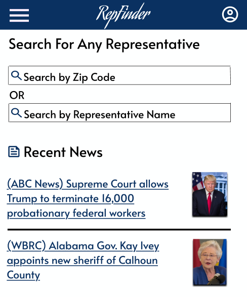
Polished interface with complete interactions and animations. The navigation menu now takes up the entire screen, and the color scheme was updated to reflect a more "American" theme. After the last round of user testing, several changes were made, including "bias ratings" on news sources, a filter menu for the news, and a notification button for representatives.
A website focused on providing a comprehensive listing of all representatives in the United States, based on the user's location and preferences.
The title and two search bars take the main focus of the home page. The search bar on the top is for searching by zipcode, and the search bar on the bottom is for searching by representative name. The navigation menu is located at the top of the screen, and the "recent news" section utilizes boxes to display news headlines.
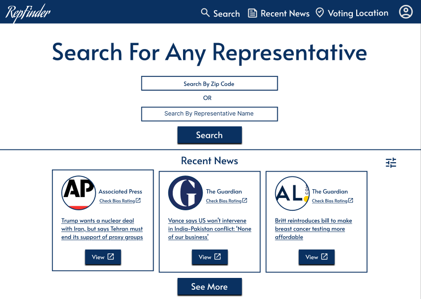
Styled interface with focus on product presentation and user interaction. Using previous user feedback, the color scheme was kept the same as the mobile app. The "recent news" section was updated to include the logo of the news source, a "check bias" button, and the news headline.
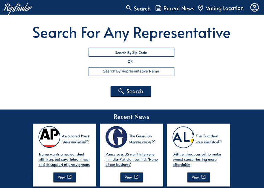
A later iteration of the desktop website. The color scheme was updated so there's a different color around the "recent news" section. This is because users were having difficulty reading it. There was also a "Find Voting Location" section added to the bottom of the homepage, as well as a footer.
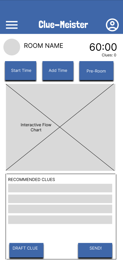
A simple user interface for a system used to send automated messages to players in an escape room game. This project was designed for a real escape room company to be used on mobile devices.
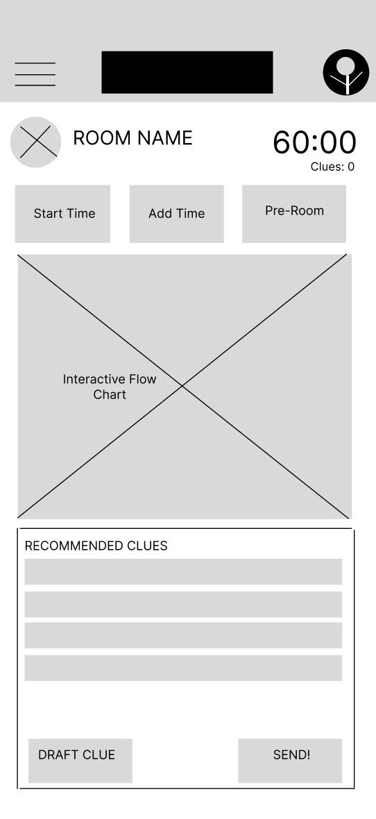
This wireframe was designed after interviewing employees for the company. The buttons shown on the screen are the most important functions for running an escape room. The section in the middle is an interactive flowchart of the game for tracking group progress, and the bottom section is pre written messages the employee can send to the group.
A color scheme was added based on the company's branding, and the navigation menu was simplified.
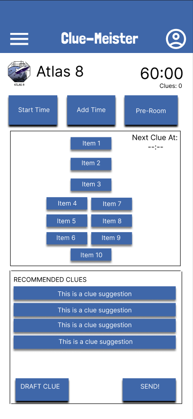
The flowchart was added to the middle of the screen, with an indicator of when the next clue will be sent automatically. The recommended messages were improved, so the button looks more appealing. Lastly, the room logo was added to the top of the screen.
During my UX design internship at CCG, I led the wireframing process for the Pediatric Dental Associates website redesign, focusing on improving user flow and accessibility for families seeking dental care. The project allowed me to collaborate with stakeholders, conduct user research, and translate insights into intuitive, mobile-friendly wireframes.
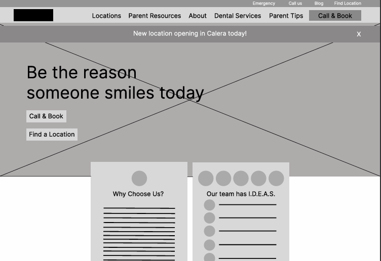
Created comprehensive wireframes focusing on improving the booking flow and making critical information easily accessible to parents. The design emphasized mobile-first approach and clear call-to-action buttons.
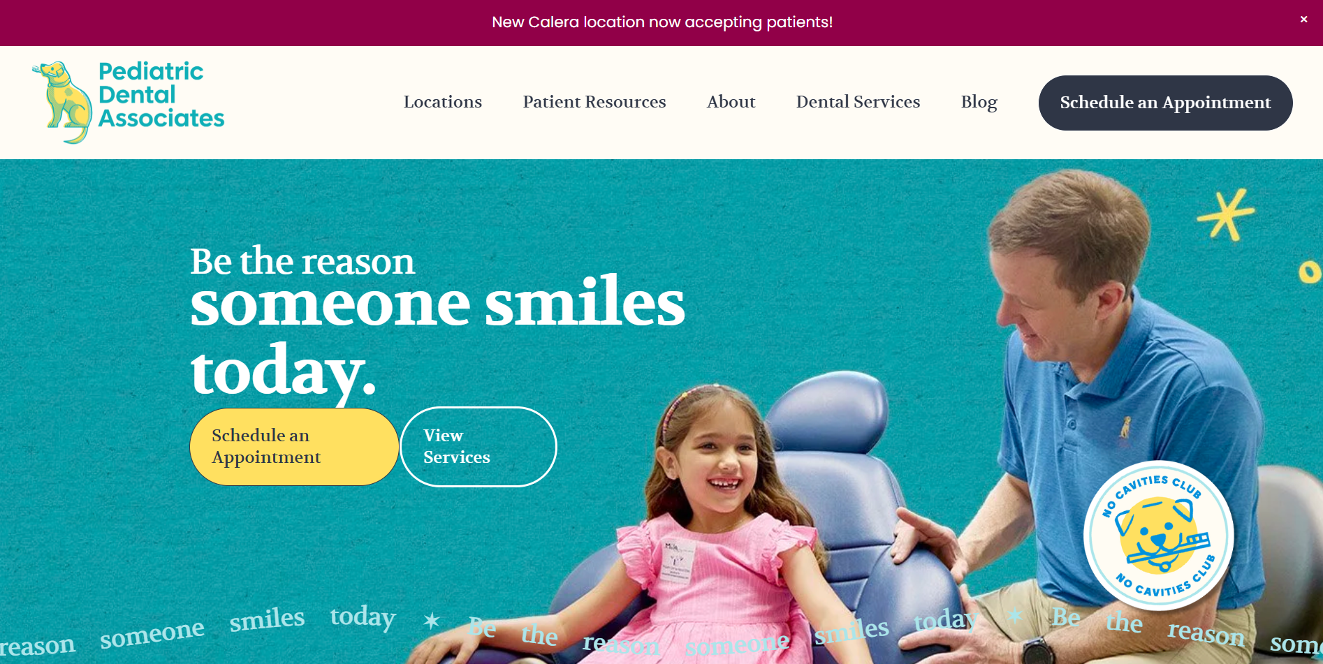
The final design incorporated family-friendly colors and imagery while maintaining professional aesthetics. Improved navigation structure and appointment booking system significantly enhanced user experience. I am currently working on this project, but it is expected to be done November 2025.
A comprehensive case study exploring the development of a healthcare provider search tool designed to improve patient access to care.
Detailed analysis of user research, design iterations, and implementation strategies for improving healthcare provider discoverability.
Read Full Case StudyAn in-depth exploration of enterprise software redesign focused on streamlining workflows and improving efficiency.
Comprehensive case study covering user pain points, solution development, and measurable improvements in user productivity.
Read Full Case StudyThoughts and insights on the intersection of design and development, exploring best practices for creating user-centered digital experiences.
Exploring the creative process behind building engaging web experiences and the impact of AI on maintaining design consistency across development cycles.
Read ArticleA deep dive into conversion rate optimization strategies and how UX design principles can significantly impact business metrics.
Understanding the relationship between user experience design and conversion metrics, with practical examples and implementation strategies.
Read ArticleCopyright © Joshua.